Is the World Losing its Colours?
Ben Le
H. D. Cartwright School
Grade 9
Presentation
Problem
Why are we noticing a change in colours around us today? Walking around parking lots and buildings, just a sea of silver, black, white schemes. There is a trending phenomenon being widely discussed in the media culture recently, all focused on one question, is the world really losing its colours. It is not only have to do with how we perceive colours when we were younger, but also links with how the modern perspective see about colours, from consumer goods, to production, to the lessening acknowledgement of arts in the past, leading everyone to move on to a more simplified designs in our world, in which they called “the new standard”.
Colourful designs are thought by modern worldviews of relating to excessive sophistication. This worldview is called chromophobia. However, some people may have forgotten how many colourful designs actually harmonize with each other to create arts back in time. One big example of colourful arts is Baroque arts. Baroque art is a direct defiance with today's chromophobic perspectives, it still builds vibrant sensation and structure of the arts together. This is a problem when the world doesn't acknowledge colours, as colours in visual arts or videos started to get duller and duller, this is slowly causing the dying of arts if none helped with this problem.
According to auto paint suppliers, more than 80% of new cars are painted to greyscale, like black white and/or grey. Other vibrant car colours are increasingly rare such as red, green or blue. It's not just cars. It is also for a lot more items. Analysis from a science museum in the UK reported over 7000 greefunyscale objects, including colours like grey, white, black or beige.
The main issue the media has to revolve around is the change in humans' preferences in colours using major psychologies, to how it affect consumer goods and/or art taste. Why we needed colours to stay and what could we do to keep it in the world around us.
Method
Not available. This is a study and/or research project, not an experiment. I will be conducting researches and studying about my topic: Is the World Losing its Colours?
Research
Imagine walking to the mall. Then all of a sudden, every store, every brand is just black, white, grey, beige,... to the point that it got so monotonous that you left. This is a rising problem related to modern consumerism, even relating to how time or age changed all of our perspective in colours.
1. Things around us\, basics Consumer goods came from very vibrant to extremely sterile in the past many decades, mostly have to do with the consumer's preferences. From car/building paint, to industrial materials, branding, and even filming is in a massive aesthetic shift. The tinted grey has mysteriously became more popular, to the point that movie directors even considered that too much colours can be "unorthodox". This is just the beginning to explaining that the world is "chromophobic". Theoretically philosophical, modernists in the early 20th century helped push Western culture’s extreme suspicion of colour. Some designers and/or architects has basically became the modern philosophers of this situation. They said sensory is suppressed due to excessive shift in simple standards. Examples can be units of design like concrete apartments buildings or the Apple Stores we see at shopping malls, etc. Nowadays, human world view often associate colourful stuff with childishness or overwhelming palettes, and it is a matter that has something to do with the aesthetic shift that is being discussed about. We still need colours in our lives. We must know that not everyone is uncomfortable with the colourful things. Lack of colours will lead to mental health problems and/or depression. Losing mental health could mean losing our moods to move on, so however our lives may shift through, we needed them to stay. We can encourage people to switch to more colourful choices in their lifestyle, switching up to a less moody and a more playful vibe.
You wonder if you actually see colours differently depending on your age. When you're young, your sight is more colourful, when you get older, the less colourful. Turns out you are not wrong. This next part will prove why the vibrant hues you're seeing fades from a yellowing effect.
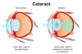
2. Some reasons vision can change as you age\, affecting tones and hues. It's not just how you get used to colour too much throughout your life that eventually it start to feel old. It has to do with the formation of a yellow cloud in your eyes called cataract. Cataracts could develop as you age, and it grows in your lenses. Elderly people often experience washed out or even altered colours, since cataracts make them harder to distinguish. Cataracts grow by clumping excessive proteins in your eyes and turn into a yellowish cloud. There are also some other reasons affecting this change-of-perception phenomenon. For example, how your pupils start shrinking, allowing less light to shine colours bright, because light is a vital part to help us see distinct tones. There is also the loss of the photoreceptors called cones in the eye cells. For instance, there are two types of photoreceptors in the eye, which are rods and cones. Rods produces shades of black and white while cones is for the perception of colours. Loss of cones equals to less colours. The change of shades is not just mentally perceived but scientifically as well. Extra Note: This research solved how the world is more “colourful” when we are young. The question has also formed a belief how children are attracted to colourful stuff more than adults. This theory has questioned how children's shows, toys and playgrounds are “loaded with colours”. Those are also reasons excessive colours are associated with childishness in the modern perspective.
It got your concern of how the world is actually turning grey. You read more of the trending topic online. You found some newsletters and start reading them. Below is an example of mine.
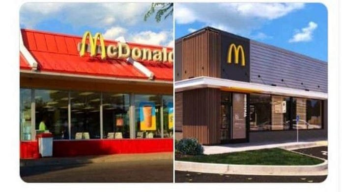
3. About Minimalism Questions now linger. Is colour disappearing from the world? This seemed too hyperbolic, but it is realistic. Today, this topic went extremely viral, mostly on social media platforms like how it stormed multiple TikTok FYP (For-You-Page). Journalism also opened their eyes to the problem and discussed it with people (which in this case, consumers). The context behind the topic made it seem like we are going in a direction that follows a doomed colourless world. A strong example are cars. Consumers nowadays have been noticed by paint manufacturers to prefer more of a grayscale palette. Purchase of black, white, gray, silver and beige cars went from around 60% of the market share in 2004 to roughly 80% in 2023—a 20% increase. Though the new palette may feel monochromatic, the ugly truth reveals that gray is preferred to make reselling and dealerships easier because those common colours can match everyone’s preferences. Fast food chains are also big examples of the Grayening of the world. McDonald’s in the 2000s had more wacky style to its restaurant with a load of colourful themes, specifically for kids, of course. Now with their minimalised state, they changed it to a minimalist design so sterile that maximalists called it “dystopian”. The core differences in minimalism and maximalism are pretty much obvious, minimalists prefer simplified schemes, while maximalists choose to design their homes with a ton of colours in every item. Minimalism nowadays are well considered to be more on the high-end. Outside of McDonald’s minimalism, tech companies now joined in the minimalist actions, including Apple, although they sometimes did maximalist devices too but not many consumers cared anyway. There are some pros and cons for each of the values: Minimalism vs. Maximalism. Minimalism makes for less effort into designing things, though it is monotonous and lacks emotions. Maximalism is the opposite. More effort, yet more vibrant with personalities. The world is not always devoid of colour as of right now. A lot of maximalists of the current generation are retrying the Y2K aesthetic to shape the world of colour again, or some big companies still being defiant with the minimalist world view, an example being the American airline company Southwest, still having bright red, yellow and indigo branding. Even so, big companies as usual are still heading closer to grayscale than ever. To bring back hues, it’s up to you, your choices.
Data
No experimental data. However, I'd show you some topic-related statistics: (Research project)
- According to major auto paint suppliers, more than 80% of new cars are now grayscale. Black, white, gray, and silver dominate the roads. Reds, blues, and greens in auto production are increasingly rare.

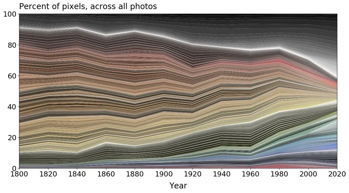
- A study of more than 7000 objects from the UK’s Science Museum found that all of these are slowly transforming into more gray tones than bright and saturated like they used to since 1800
- The big difference of filmmaking over many decades. Filmmakers even said it was ‘unorthodox’ to have such bright colours on Napoleon.

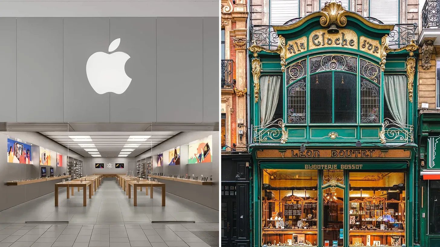
- Comparing modern Apple Store to a vintage-looking shop, proving older aesthetic have more colour:
- Roughly 45% of people in their 70s are affected by abnormal colour vision changes.
- And 50% of people in their 85+ are affected.
- The purchase of grayscale (black, white, gray, and silver) cars went from around 60% of the market share in 2004 to 80% in 2023—a 20% increase
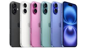
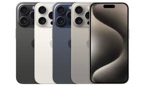
- Though most iPhone from Apple being grayscale, iPhone 5c is their first attempt in making phones with more diversely colourful spectrum, they did it again with the iPhone XR, and then did it again every generation of phone subsequently, but the thing is most people still rather buy generic and simple grayscale phones
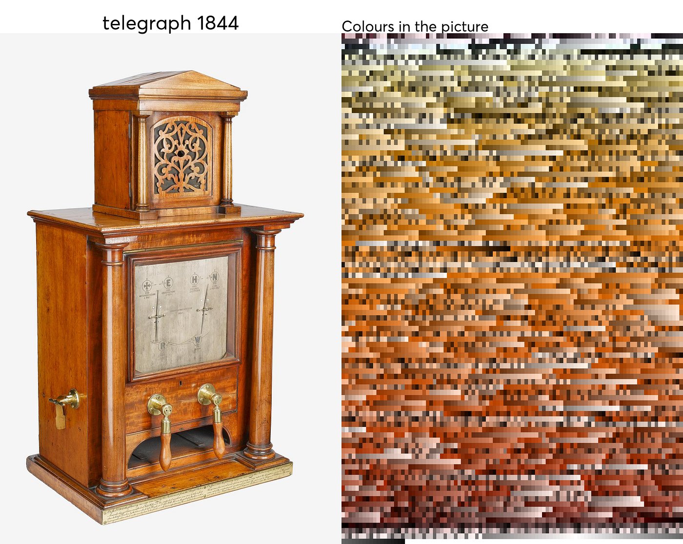
- Here is a colour design of a telegraph from 1844:
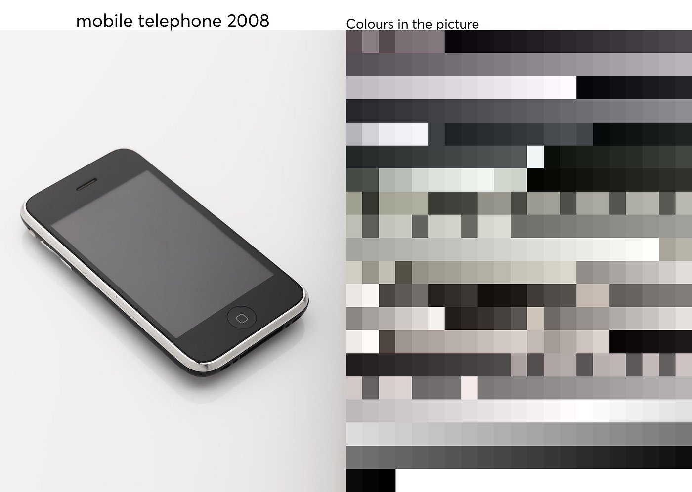
- And here is a colour design of a mobile phone from 2008:
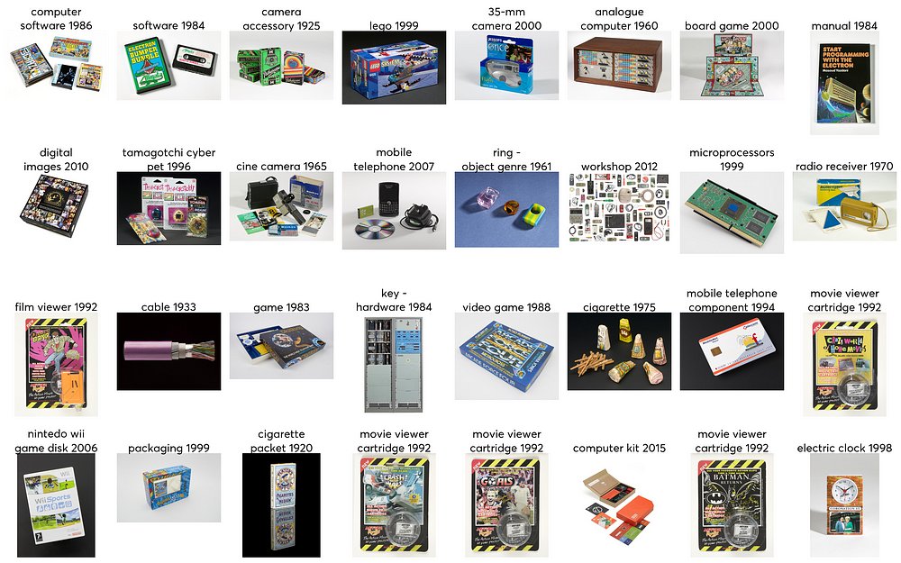
- The Item & colour research from the UK Science Museum - Note: Colour/Shades are extremely crucial parts of designing/manufacturing consumer goods.
- A trending photo comparing McDonald’s design from the 2000s vs. 2020s (this photo exploded on social media recently)
Conclusion
Yes, the colours are fading away. This is the mass aesthetic change in our society, and how our perception not just biologically, but to the items around us as well. We needed the colours to stay, because they are psychologically proven to enhance mental wellbeing through the uniqueness of the tones. Going into the future, grayscale are more preferred. And even though we can’t decide someone’s lifestyle to be minimalist or maximalist, it’s up to you to make everyone aware of the fading situation. Because you can’t make someone do it, then only your decisions matter most.
Citations
(All of my citation is in the format of 7th-ed. APA)
1. The Culturist Amato, E. (2025, April 2). Why Is the World Losing Color? The Culturist. Retrieved January 8, 2026, from https://www.theculturist.io/p/why-is-the-world-losing-color
2. North Florida Cataract and Vision Care Wasylow, D. (2025). 5 Reasons Colors May Look Different as You Age - North Florida Cataract and Vision. Northfloridavision.com. https://www.northfloridavision.com/blog/post/2025/8/5/5-Reasons-Colors-May-Look-Different-as-You-Age.aspx
3. Ads Intelligence Team, A. B. (2025, February 17). The Grayening. Is Color Disappearing from the World? - AdsIntelligence. AdsIntelligence. https://adsintelligence.marketing/2025/02/17/an-in-depth-discussion-on-color-and-design/
4. Cataract Image - Fichte https://www.fichte.com/cataract-surgery-buffalo/what-are-cataracts/
5. More Cataract Images - Clinical Advisor and Exeter Eyes (Only in Log Book)
- Facts about cataracts. (2012, December 14). Clinical Advisor. https://www.clinicaladvisor.com/slideshow/slides/facts-about-cataracts/
- Cataracts - Eye Conditions. (2024, July 4). Exeter Eye. https://www.exetereye.co.uk/eye-conditions/cataracts/
6. iPhone Colour Images - Six Colors and TechRadar
- Review: iPhone 15 Pro & Pro Max. (2023, October 5). Six Colors. https://sixcolors.com/post/2023/10/review-iphone-15-pro-pro-max/
- Rogerson, J. (2024, July 21). iPhone 16 colors: every shade for every model. TechRadar; TechRadar. https://www.techradar.com/phones/iphone/iphone-16-colors
7. UX Magazine - Miscellaneous Data Hsiao, E. (2024, May 14). Why is The World Losing Color? UX Magazine. https://uxmag.com/articles/why-is-the-world-losing-color
Acknowledgement
I would like to acknowledge a few people that have helped me in this project. Thanks to Ms. Offord for providing me an opportunity to participate in the CYSF, and thanks to the other students who is also participating to help me catch up and not lose track. Acknowledging the whole teacher's team of my school for teaching me great knowledges everyday, including science. Thanks to my family for encouraging me to do this science project. Thanks to my best friends of instructing me what to do before and during the fair. And also thanks to the CYSF staff for helping to organize a great event to let youths all of Calgary to explore more about the vast world of science around them.
Sincerely, Ben Le