Flattening the Globe
Grade 8
Presentation
No video provided
Problem
Problem
For the last year or so, I had become interested in anything to do with maps, countries, flags and physical geography. But when I looked at my globe, and then at my world map, I wondered how flat maps are made from a spherical world.That thought started this project.
After quenching my curiosity online, I learned that there are different types of maps called projections. I also saw that there was a unique problem with all different map projections relating to how it is impossible to flatten a sphere. In fact,there are many projections that people can choose from, yet each projection has a separate problem. The two most common problems are size distortion, making land masses larger or smaller than they actually are depending on their position, or shape distortion, making a landmass' appearance incorrect.
Size distortion is a bad trait to have on a map if you are trying to compare what X country’s size is to Y country's size. For example the most common size distortion map is the Mercator projection which stretches out the edges making places like Greenland and Antarctica significantly bigger than they are supposed to be (See Figure 1). However with the Mercator projection, any direction (N,W,S,E,NW,...) is exactly that direction on the map, so it is very good for navigation.
Figure 1 : Mercator Projection. Notice the enlarged Greenland and Antarctica, as well as all the directions being well placed.🌍

Other map projections can have the sizes of landmasses exactly correct, allowing size comparisons to be accurate (See Figure 2), but these usually have shape distortion. But sadly, other parts of comparing are not so accurate, especially traits like width and shape, holding back the entire accuracy of the map. These distorted maps also let details in the maps disappear due to the crunching up of more northern, southern, and edge landmasses such as in the sinusoidal projection, but the more centered countries still have a more accurate shape.Other map projections similar to the Mercator projection can have extremely accurate shapes on the map, even if they are distorted in a different way.
Figure 2 : Sinusoidal Projection. Notice that the size is conserved, yet the shapes of the land masses are distorted.

There are many map projections, but each one has at least one problem, such as distorting the size or shape. In this project I attempted to solve these problems and find a way to flatten a globe to minimize distortion.
Problem: How to flatten a globe with minimal distortion? How to change a 3D surface to 2D surface?
Method
Method
The following are three methods that I used to transform a 3D surface to a 2D surface.
Method One: Cutting a Beach Ball
Just a couple of months before I started science fair, I got an inflatable globe for my birthday, and this gave me an idea of how I would get my data. I would cut beach balls in a multitude of ways to flatten the sphere as much as possible. I bought several plastic, inflatable, beach balls, and then I prepared the balls by drawing the latitudes and longitudes imitating a globe. I initially decided to cut all of the balls in the style of various sports balls because balls are stitched together with 2D surfaces to create a sphere:
- A beach ball, cut on the meridians. (Vertical lines that divide the colors).
- A soccer ball pattern, with hexagons and pentagons.
- A baseball/tennis ball, cuts a sphere into two equal area pieces.
- A basketball, a baseball that was cut into quarters.
- A volleyball, eighteen panels, that make six squares.
When thinking what other pattern I could use to flatten a sphere, I made:
- A spiral pattern, kind of like an orange peel.
- A spider type pattern, where I cut along a single meridian to cut a slit, and then cut along the parallels almost completely.
I drew my patterns on the balls with a sharpie, and a long, bendy ruler to make the measurements as accurate as possible. I cut out those balls to make the flattest possible surface, but still keeping a good relationship between pieces of land (See Figure 3 for example).
Figure 3 : Latitudes and Longitudes. Notice how the image on the left is more bumpy than the image on the right, but it has more connections between the pieces.

Method Two: Projections
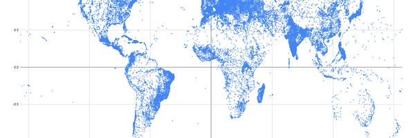
After researching about projections, I wanted to create some on my own.The first step was to find longitude and latitude data of the land masses on earth.This herculean task was fruitless, so instead I found the latitude and longitude of every city on earth. I inputted the data into google sheets and plotted the points.This worked just fine, and the scatter plot appeared as if it was the land masses themselves. Then, I searched up different projection equations to apply to the longitude and/or latitude. I applied:
- Gall Stereographic,
- Sinusoidal,
- Mercator,
- Lambert,
- Central Cylindrical,
- Equirectangular
formulas to every city's coordinates, and saw how they changed the world’s appearance.
While I could see how a unique projection changed the globe's appearance, I couldn’t tell exactly how the formulas changed the map. Therefore, instead of every city’s coordinates, I created a numerical grid on a scatter plot. After applying the projection formulas, I could really see every projection's distortion. (See Figure 4)
Figure 4 : Sinusoidal Trinity. Notice the top image is a sinusoidal grid, the middle image is using every city on earth, and the final image is a sinusoidal projection map.

Method Three: Lenses
In science class at school, I learned about lenses and mirrors, and how convex lenses can create a real image. During an experiment, we drew a picture on a light bulb, and shone it through a lens to create a larger image on a screen. I then took this idea and decided to apply it to creating a flat map.
Initially I attempted to draw longitudes and latitudes on a spherical lightbulb, and shined it through a lens to magnify the pattern (See Figure 5). Trying to draw parallel and meridian patterns by hand proved inconsistent, thus, I made a circular stamp to apply a pattern to another light bulb, making the pattern much more consistent and able to be compared/ measured. I then used the same lens to magnify the stamped light bulb, and drew what was magnified onto a large piece of paper, comparing the size of the edge circles to the central circles.
Figure 5 : Magnified Bulb. Notice the lens and how large the magnified image is.

Research
Research
-
Projections
-
Types of Projections
- What are they?
- They distort the longitude and latitude coordinates onto a 2D plane.
- Examples of famous projections are;
- Sinusoidal, equal area, and diamond-shaped,
- Mercator, stretches the poles and shows the shapes very well,
- Lambert, viewed from a pole and cut from a conical shape,
- Central Cylindrical, over-stretches the poles,
- Equirectangular, the poles are squished vertically but widened as well,
- Gall Peters, stretches out the center area to show correct sizes but extremely distorts the shape. Ranking Projections
- How much Size and Shape distortion?
- What are they?
-
How to Create Projections
- On a globe, λ = Longitude, φ = Latitude, λ0 = longitude of the central meridian, φ0 = latitude of the central parallel.
- On a map, x = →, y = ↑
- Analyzed via area conservation, shape distortion, and orientation.
-
|
Name |
Equations |
Analysis |
|
Sinusoidal |
x = (λ-λ0)*cos(φ) y = (φ-φ0) |
Area: Conserved perfectly Shape: Edges are squished horizontally. Orientation: Edges turn diagonal instead of staying upright. |
|
Mercator |
x =ln(sec(λ)+tan(λ)) y=ln(sec(φ)+tan(φ)) |
Area: More northern and southern areas are too large. Shape: No distortion. Orientation: Constant directional lines match perfectly; it is a square. |
|
Lambert |
Put a cone on the earth at the poles so that it goes through one latitude to another depending on how much of the earth you want to see on the map. |
Area: Areas near the outer edges are larger. Shape: No distortion Orientation: North is at the center of the map, rather than up. |
|
Central Cylindrical |
x = (λ-λ0) y = tanφ |
Area: Areas near the northern and southern edges are gigantic compared to the central area. Shape: Distortion near the poles, and it is impossible to show the full map. Orientation: North is up, but the corners are too far upward; it is not a square. |
|
Equirectangular |
x = λ y = φ |
Area: OK conservation, but not perfect. Shape: Squashed vertically near the poles Orientation: North is up, but the corners are too far sideways; it is not a square. |
|
Gall Peters |
x = 2λ y=sinφ |
Area: Perfect conservation Shape: The central area is extremely stretched vertically Orientation: North is up, but the corners are a little too far sideways; it is not a square. |
|
Robinson |
Not specified by a single formula, but rather, a table of values depending on the latitude. |
Area: Not perfect conservation Shape: Slight distortion, but still appealing Orientation: North is up, but the map is too rectangular. |
|
Goode Homolosine |
A combination of projections, one that captures the land around the north and south of the Earth, and one that shows the correct sizes of land masses for the tropical areas of the Earth. (Center) |
Area: Perfect conservation Shape: A little distortion, but not a very noticeable amount Orientation: North is up, but there are interruptions in the ocean areas, not very good for navigation |
|
Fuller |
A projection onto an unfolded polyhedron. |
Area: Not perfect conservation Shape: Slight distortion, but still appealing Orientation: The center of the map is north, and many interruptions in ocean areas |
|
Name |
Map |
|
Sinusoidal |
|
|
Mercator |
|
|
Lambert |
|
|
Central Cylindrical |
|
|
Equirectangular |
|
|
Gall Peters |
|
|
Robinson |
|
|
Goode Homolosine |
|
|
Fuller |
|


-
Convex lenses
-
Convex lenses can create real images that are magnified, which you can project onto a piece of paper. If you use a sphere as the light source, you can almost make an orthographic projection. (A view of a sphere from infinitely far away.)
-
-
How to Cut Different Ball Shapes
-
Beach Ball
- Cut on the longitudes to make a flower shape.
- Cut on the longitudes to make a flower shape.
-
Soccer Ball
- Cut out of hexagons and pentagons.
- Cut out of hexagons and pentagons.
-
Tennis Ball
- Cut a sphere into two equal area sides that can be smoothened.
-


-
Volleyball
-
Cut into 18 strips, 3 to make 6 equal area squares.
-
-
Basketball
- A tennis ball shape, cut into two.


Data
Results
I got the following results from trying to transform a 3D surface into a 2D surface.
Results One: Cutting a Beach Ball
- A beach ball, cut on the meridians. (Vertical lines that divide the colors).
|
Image |
Explanation |
|
|
I started by cutting the ball along the longitudes to split the colors one-fourth on each pole. |
|
|
Because the previous image was not very flat, I cut down more on the longitudes, but it was still not perfectly flat. |
|
|
After I cut more down, the smoothness of the ball was better, but not the best. |
|
|
I cut until all the pieces were almost separated, but where it did connect was still too rough. |
|
|
Beach Ball Line Map: After I cut all the colors, though, I displayed them side by side, and there was a good amount of flatness. |
|
|
I can display it to appear like a flower, and if it were a globe, it would be focused on the pole going outwards. Beach Ball Flowers: The final cut-out beach ball has a very well-conserved area and shape, but sadly a very bad orientation due to many interruptions throughout the shape, and also no or minimal connection between pieces. |


- A soccer ball pattern, with hexagons and pentagons.
|
Image |
Explanation |
|
|
I measured one side of a hexagon on a soccer ball and the total circumference of the soccer ball. I then took the measurements of the circumference of the beach ball to know how much I had to scale up the hexagons so I could transform the beach ball into a soccer ball. I started by making a hexagonal shape that I adjusted to the correct size for the beach ball and then traced the stencil onto the sphere twenty times, being sure to apply each polygon to create twelve pentagons in between five hexagons. |
|
|
After all the tracing, it was time to cut. I cut out all the shapes and formed a pile of twelve pentagons and twenty hexagons. |
|
|
I took all the polygons that I had cut up and arranged them the best I could, trying to match up the white areas and the colored areas. After the “flattened sphere” was correctly displayed, I numbered each piece to easily recreate it later on. |
|
|
The final shape was centered around a pole with three arms extending out. Soccer Ball Map: It has a preserved area and not a lot of shape distortion. It is better than the beach ball because the pieces are smaller and flatter. However, it has many more cracks between many pieces and has the opposite pole on only one of the three arms. |


- A baseball/tennis ball, cuts a sphere into two equal area pieces.
|
Image |
Explanation |
|
|
I was stumped on this portion of this project for some time, brainstorming ways to create the shape of a baseball due to the strange shape of the curve that cuts the ball into two equal pieces. Then, a couple of weeks in, it hit me: the curved areas of the baseball were just two connected circles, a bit smaller than the circumference. So, I drew the two smaller circles symmetrically on the ball and then connected them with a sort of bridge. But I had to make sure the bridge was also a curve of the same curvature to create the other two circles. I drew that on the beach ball, and I was then ready to cut. |
|
|
I cut out the lines, and two large pieces appeared. As I was guessing, they weren’t the same size. Also, they weren’t very flat, so they were not good for a map. Also, the actual shapes could not be connected due to a thin bridge in the center, so orientation was not good at all. |


- A basketball, a baseball that was cut into quarters.
|
Image |
Explanation |
|
|
Basketball Map A basketball is just a baseball that is cut in four, transforming two pieces into eight. I then arranged the eight pieces into an eight-pointed star that appeared similar to my first beach ball cut-up. |
|
|
Basketball Vs map: There were many ways to arrange the eight pieces, so to add more connections between the land, I created M shapes that are connected near the poles so that the line is fluid. |
|
|
The last way I arranged the cut-up basketball was by just placing all eight forms in a straight line. Basketball Line Map: The basketball shape is a “child” of the beach ball and the tennis ball. It does have okay shapes and size conservation, but depending on how you arrange the pieces, the land masses can be more or less connected but cannot have perfect connections between all pieces without interruptions. |


- A volleyball, eighteen panels that make six squares.
|
Image |
Explanation |
|
|
It was very difficult to find a way to create the shape of a volleyball because the volleyball is formed from six squares, but each side of the “squares” is curved, not straight. Each of the squares fits into the other squares, one side concave, and the other convex. Similarly to the soccer ball creation, I had to measure a volleyball’s “square” side length and its circumference. Then, knowing the beach ball’s circumference, I was able to figure out the length of the square needed. I had to use my bendy ruler to create a concave curve that matched up with another square’s convex side. I then traced the pattern on the beach ball six times until it was practically a bloated cube. |
|
|
I then cut out the “squares” and made a cross out of the six very bumpy pieces, but I wasn’t done yet. The “squares” in a volleyball are also cut length-wise into three roughly equal pieces. So, I traced the center strip from an actual volleyball, scaled it up as I had done before, and placed it upon the rectangles to trace. |
|
|
I cut each rectangle into three thinner rectangles and set them back up into a cross formation. Volleyball Map: A volleyball is a bloated dice that is split into three. It has nice flatness, meaning good area and shape conservation, but it has horrible connections between parts, and it is very difficult to understand the direction and orientation if it was used for a map. |


When thinking about what other patterns I could use to flatten a sphere, I made:
- A spiral pattern, kind of like an orange peel.
|
Image |
Explanation |
|
|
I started this beach ball by cutting into and then around it in a spiral motion to have an “orange peel” look. After I cut around and around, trying to make the thickness as uniform as possible, I finally finished, and it was time to start making it flat. |
|
|
I placed down one of the poles first and then started to apply the plastic string. I had to stretch and tape the beach ball onto the ground to match up the colors, and when I noticed it was getting too difficult, I snipped it and started on the second pole until I ended up with two circles. |
|
|
I finally had two circular sides of a beach ball with all the colors matching up. The plastic did tear sometimes, but it all worked out. Spiral Map: This version of a beach ball is an orange peel style, and it is very connected and very well made, with two circles with barely any interruption. But, because I had to stretch the plastic to match up colors, it probably wouldn’t have a very good conservation of area or shape if it were a projection. |


- A spider-type pattern, where I cut along a single meridian to cut a slit, and then cut along the parallels almost completely.
|
Image |
Explanation |
|
|
Spider Map: For this style of cutting, I drew some parallels on the beach ball and then did the opposite of what I did for my first cut. Instead of cutting on the meridians, I cut up the parallels, and this worked perfectly. This is my design, and I think it looks beautiful. |
|
|
Grid Map: After cutting on the parallels, I then recut the beach ball, but on the meridians, and when I arranged it, it looked very similar to the first try I did. |
|
|
I then rearranged it to be a mix of both my “spider” and my cut-up beach ball map. Spider cut up Map: This “spider” is a very good projection; it is the opposite of my first cut-up beach ball, but it seems like it turned out better. I assume that the thinner you cut, the flatter it will become. It has an excellent conservation of area and shape and is centered around one landmass so that it could show one continent. |


After cutting all the different patterns on beach balls, I then needed a way to rank them, to see which of the ball cuttings was the best strategy for a map. So, I took photographs of the patterns laid out on the floor from a bird's-eye view and painted the background(everything but the beach ball) green. I did this because that color did not show up anywhere in the patterns of the beach ball, and then I could use a computer graphics program (GIMP) to count the number of pixels of the photograph that were green. I then cropped the image two ways: 1. Connected Map: I created these maps as if one tightened a string around the edges, not allowing any concave areas of the map. 2. Efficient Map: I made some more liberal cuts, allowing concavity, but thinking about it as if it were a real map. With these two map-creating strategies, I found the total number of pixels on each map and found the total number of green pixels on the map using the GIMP graphics program.
% interruption = # of green pixels / # of total pixels in the map
I then divided the two numbers to find the % of the map that was interrupted. The results of this ranking are given in the graph below.
The least amount of interruption from the Connected Maps was the basketball pieces put into a line, while the basketball flower orientation had the highest % of interruptions. The lowest percentage of disruption for the Efficiency Comparison is the soccer ball, and the highest percentage of interruptions belongs to the efficient cut-up spider.
Figure 6: The image on the left has the least % of interruptions in the connected maps, and the map on the right has the most.


Figure 7: The image on the left has the least % of interruptions in the efficient maps, and the map on the right has the most.


Figure 8: The more vibrant colors are the efficient versions of the maps, and each different color refers to a different ball(Ex.Beach ball, basketball…)The lower the bar, the less % of interruption and the better the map is.
Results Two: Projections
In this portion of the project, I used Google Sheets and the collected data of where all the cities are on the globe. I wanted to prove that with a single formula, I could transform a 3D sphere into a 2D plane. This worked well, so then, I wanted to see the distortion that the different projections in the form of formulas caused to the map. So, I made a grid out of dots corresponding to the latitudes and longitudes and put them through the same formula transformations. Then, I plotted these dotted grids onto a scatterplot to see the distortions.
|
Cities of the World |
Distortion Map |
Projection and Explanation |
|
|
|
Gall Stereographic This projection is an easy medium between two extremes. It alters both shape and area, to make it appealing. |
|
|
|
Sinusoidal It keeps the distance between the latitudes the same but changes the longitudes to more of an oval shape overall. |
|
|
|
Mercator As you can see in the distortion map, the Mercator projection has much higher up poles than on a globe, enlarging northern and southern landmasses. |
|
|
|
Central Cylindrical Like the Mercator projection, the poles are unevenly spaced northward, but this time, extremely. The actual map with the cities is not symmetrical vertically due to there being more cities higher up than in the south, as there are no cities in Antarctica. |
|
|
|
Equirectangular All the latitudes and longitudes are evenly spaced. This projection, too, is not perfect in both size and shape because, on an actual globe, the poles are smaller than the equatorial region, unlike this projection. |


I also thought of a new projection (I haven’t found it anywhere after a quick search). I first took the formula of the central cylindrical projection, which projects the land masses on the globe onto an infinitely upward and downward cylinder. Realizing that the north and southern poles would never be projected in this projection, I thought the cylinder doesn’t have to be infinite, but with a flat top and bottom. But then, I thought it would be even better if the top and bottom of this new cylinder were another cylindrical projection. This created a cube-type object with curved edges, like a cylinder, rather than flat(See Figure 9).
The math of this proved quite difficult, but finally, I figured that my new blended projection would have an “if” statement (in Google Sheets). So I added; if long. > 45°, tangent(90°- Long.), otherwards tangent of long to the formula.
This projection has the following characteristics: the equator and the polar regions have great area and shape conservation. The worst part of the projection is the regions around 45 degrees north or south.
Figure 9: The two different colored cylinders intersect, and notice how they are equal in size. Imagine a globe in the middle, and then once you unfold the projection, you will get the desired results of my blended projection.

Results Three: Lenses
In this portion of the project, I used light bulbs and convex lenses to magnify and flatten a part of a sphere. Unlike the other parts of this project, I am creating an orthographic projection, which only shows almost half of a sphere instead of it all. I will be measuring to see how much difference there is between the edges of my projection and the center.
|
Image |
Explanation |
|
|
I first used rope to draw longitudes and latitudes on my circular light bulb and then set up a station to do my experiment. I used my washroom, which doesn’t have a window, and then taped the light socket to the table, readied the lens, and a piece of white cardboard to see the reflected image. |
|
|
After the preparation was done, I turned on the light and saw what had been reflected. It looked alright, but right then, I realized that the squares were too big, and I couldn’t compare the different sizes accurately. |
|
|
So, instead of redrawing smaller squares to compare, I made a stamp out of an eraser to easily apply the same size and shape objects onto my bulb, so I was ready. |
|
|
I inserted the new ball, and it worked very nicely. I could see the circles with some difficulty but could see the distortion it had made. I then put an actual piece of paper behind the projected image to trace and measure the distortion. But there wasn’t that much area distortion; it was minor, the outsides having a width of 4cm and a height of 2.5cm, and the center has 3.2cm of both width and height. So the shapes were stretched sideways and squished the other way, turning into ellipses. |
|
|
I finally tried the same thing but with a stronger convex lens, and with it, I could decide if I wanted the edges or the center more visible by moving the lens. With the stronger lens, the refracted image was much more distinct. |


The refracted image did not change by much in terms of area, though it did change in the shape of the circles. This projection only showed about half of the sphere, but it did it pretty well.
Conclusion
Conclusion
In this project, I did three experiments that allowed me to flatten a 3D sphere into a 2D surface. The first experiment was where I cut beach balls in patterns such as soccer or tennis balls. Then, I would find a formula for existing projections and make my versions of those maps, and then a grid with the same formula would be used to show the distortion. Finally, I used a convex lens to project a sphericle lightbulb onto a flat piece of paper, making almost half of the lightbulb visible on the 2D surface.
Balls
I bought seven identical beach balls on which I drew different patterns inspired by sports balls. I then cut out the pattern into flattened pieces and assembled them onto the ground to show a flattened sphere (See Figure 6). The majority of my cutouts were flatter rather than bumpy, while the rest were hard to flatten due to their size; I noticed that the smaller and thinner the pieces were, the flatter they would be. The problem with using this method to flatten a globe is that there are interruptions between the pieces. The smaller the pieces, the more interruptions. If it were an actual globe that I cut, many landmasses would be split in the middle. To determine which “ball map” was best, I used an image manipulation application (GIMP) to count the number of pixels in the background of my cutouts to see how much of the map is interrupted, and the best two “ball maps” are the basketball pieces in a line, and the soccer ball.
Figure 9: Notice that the last image is the assembled flat surface and how it has many interruptions, so I had to pick my poison between more flat or less interruption.

Because of the issue with interruptions, I had cut one of my beach balls like an orange peel with a very thin spiral (See Figure 7), and when placing it on the ground, I tried my best to have no interruptions; it did work, I made two equal circles that where flat and had barely any interruption. But to get to that result, I needed to stretch the spiral to match up “landmasses”(colors on a beach ball), especially at the outer edges of the circles. This means that the area of those landmasses would be stretched instead of being equal area like other cutout patterns.
Figure 10: Notice the two circles. I had to stretch the spiral near the edges, leading to ripping in the plastic.

Projections
I downloaded the coordinates of the longitude and latitude of every city on the globe, and I entered them into Google Sheets. To test the formulas of each projection I had collected in my research, I started by making a simple map projection called the equirectangular projection, where the x-axis is the longitude of a globe, whilst the y-axis is the latitude of a globe. With the same data, I used the formulas of different projections and created a scatter plot, which resulted in different maps with different attributes. I then compared the scatter plots to maps of the same projection, and they matched up nicely.
Now that I could make my own maps, I wanted to see the projection attributes, so I created a grid on Google Sheets and then applied the same formulas to see exactly what each projection looked like (See Figure 11).
Figure 11: Notice that the left image is a distortion map, and the right is an actual map. Also see how on the left, the distance between the lines is equal, but the center dots are farther away than the more northern and southern lines.


Each projection distorted at least one of three things: Shape, Size, or Orientation. Each of the projections I tested, apart from the sinusoidal type, had a good orientation because they all had the north as upwards, south as downward, east rightwards, and west leftwards for all landmasses; whereas, the sinusoidal projection did not have north necessarily up. For the sinusoidal projection, it may not have good orientation, yet it keeps the area of landmasses well conserved. However, this is not the case for many of the other rectangular projections. This analysis shows that a map projection can not hold all three attributes perfectly, but they can be close.
Lenses
Finally, I bought spherical lightbulbs, applied equal-sized circles onto them, and then projected them onto a piece of paper. I projected the pattern via a convex lens, which refracts the image upside down and creates a real image (unlike a concave lens that creates a virtual image). I then took measurements of the circles on the outside of the projected lens and compared them to the inside circles. They turned out to be very similar sizes, which means that the distortion of shape and area is not significant (See Figure 12).
Figure 12: I am drawing the circles throughout the projected image to measure later on and see how the ones on the edges are stretched out.

This experiment was a demonstration of a physical projection, rather than a mathematical formula. This can be also mimicked by taking a photograph of a globe (see figure below). The lightbulb image through the lens and the photograph are both orthographic projections, and they both project only one side of a sphere onto a flat surface.
Citations
Bibliography
Kuvina Saydaki. (2023, July 29). Map Projections: the Math Behind Every Map [Video]. YouTube. https://www.youtube.com/watch?v=bpp0xCknQAQ
List of map projections. (2025, February 20). In Wikipedia. https://en.wikipedia.org/wiki/List_of_map_projections
Mercator Projection. (2025, March 18). In Wikipedia. https://en.wikipedia.org/wiki/Mercator_projection#Mathematics
Equirectangular Projection. (2024, September 1). In Wikipedia. https://en.wikipedia.org/wiki/Equirectangular_projection
Sinusoidal Projection. (2024, December 4). In Wikipedia. https://en.wikipedia.org/wiki/Sinusoidal_projection
Central cylindrical Projection. (2024, November 27). In Wikipedia. https://en.wikipedia.org/wiki/Central_cylindrical_projection
Gall stereographic Projection. (2024, September 1). In Wikipedia. https://en.wikipedia.org/wiki/Gall_stereographic_projection
The Geographic Grid. (n.d.). Geography.name. From https://geography.name/the-geographic-grid/
SimpleMaps. (2010-2025). Free world cities database. Retrieved March 18, 2025, from https://simplemaps.com/resources/free-country-cities
Acknowledgement
I aknowledge my mother for helping me find the data of every city in the world and supporting me along the way.